The bread and butter of Content Management Systems (CMS) are Grid Layouts and Components. Umbraco's standard approach to building grid layouts utilises a feature (known as a Data Type) called Umbraco Block Grid. Out of the box, Block Grid ships with its own CSS styling, but what if you prefer using a different Grid system, for example Bootstrap Grid. During content creation, one of the limitations of Umbraco BlockGrid is the lack of ability to view the page layout in the back-office in a format that resembles how it will appear when published. As standard, content creators will only see a label within the Block Grid that represents their content in the back-office. To understand what the content actually looks like, the content creator has to preview the page in order to view it as a finished set of rendered components.
At the end of this article you will understand how to easily set up Umbraco Block Grid to work with the Bootstrap CSS Grid system and also have your Block Grid Components render in the Back-Office to assist with content generation and layout.
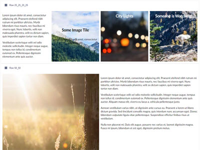
These are the 6 easy steps to configuring Umbraco Block Grid to work with Bootstrap CSS Grid and also have Block Grid components render in the Back-Office:
Step 1. Define Block Grid Row and Content Component Element Types
Step 2. Create a Block Grid Component to Utilise New Element Types
Step 3. Customise Block Grid Views to Use Bootstrap CSS
Step 4. Create Custom Component HTML for Block Grid Components
Step 5. How to Render Umbraco Block Grid Components in Back Office
Define Block Grid Element Types for Grid System and Components
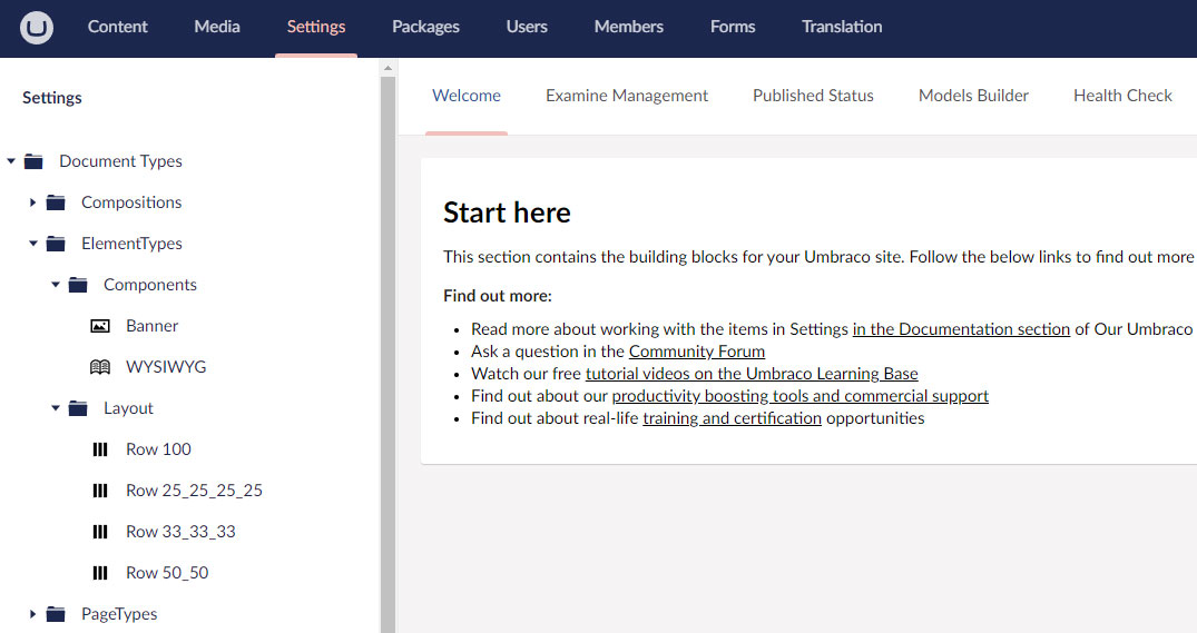
Step 1 involves creating new Umbraco Element Types to represent each Row layout required in your grid. Typically, grid systems work to 12 columns per row, which fits nicely with Bootstrap Grid CSS. Working within the Back Office Settings tab you can see we have created 4 element types called:
- Row 100 (a row with one column spanning the entire row of 12 cols)
- Row 25_25_25_24 (4 Columns, each spanning 3 cols each)
- Row 33_22_33 (3 Columns, each spanning 4 rows each)
- Row 50_50 (2 Columns, each spanning 6 columns each)
These Element types are placed in their own Layout folder to keep them separate from actual Components to be used within the Block Grid.
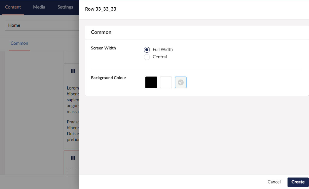
To enable us to fully utilise the Bootstrap Grid, each of these Layout Element Types inherits from a custom Base Composition that will give each row a Background Color and Screen Width property. Screen Width is just a simple Radio Button list with 2 options - Full Width and Central. Background Colour utilises the Umbraco Color Picker data type:


Each of the new Row Element Types inherits from the Base Layout Composition, but have no properties of their own:

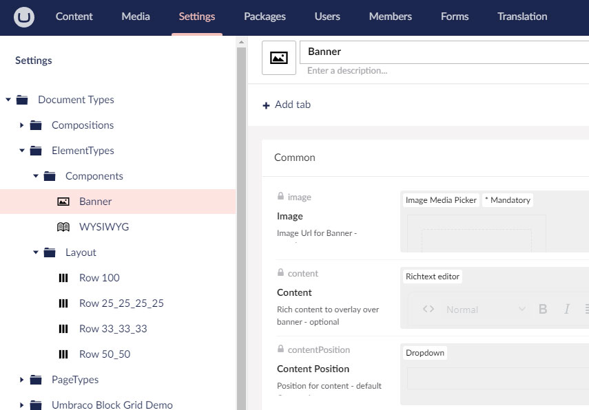
Finally we create a couple of simple custom Block Grid components to show off our new Grid and Umbraco back office component rendering,
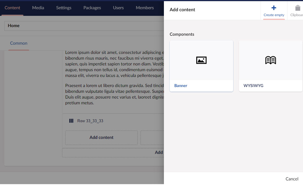
After creating a new Components folder within the Element Types folder, the next step is to add 2 new Element Types to represent each component. You can see we have created a Banner Element Type and also a WYSIWYG rich text component.
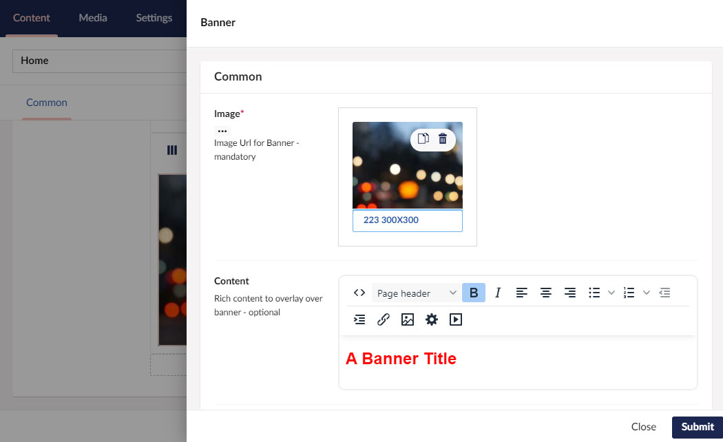
Each has several properties, for example the Media Selector data type is used for the Image and the Umbraco Rich Text editor for the Banner word content.
Step 2 - Create A Block Grid Content Control for Layout and Custom Components
Now we have our Grid and Custom Components set up, the next step is to create a custom version of the Umbraco Block Grid Data Type and add our Layout and Custom Components to it. Working within the Settings > Data Types folder, select the existing Block Grid Data Type and create a copy called BlockGridContentPage.
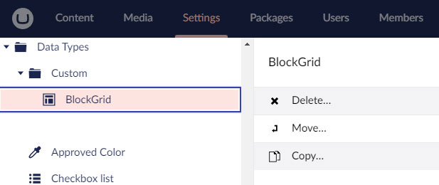
You should end up with something like this:

Next, create two Groups called Layout and Components. Once the folders are created, click the Add Block button and add the Layout Element Types to the Layout group and the Custom Component types to the Components group:
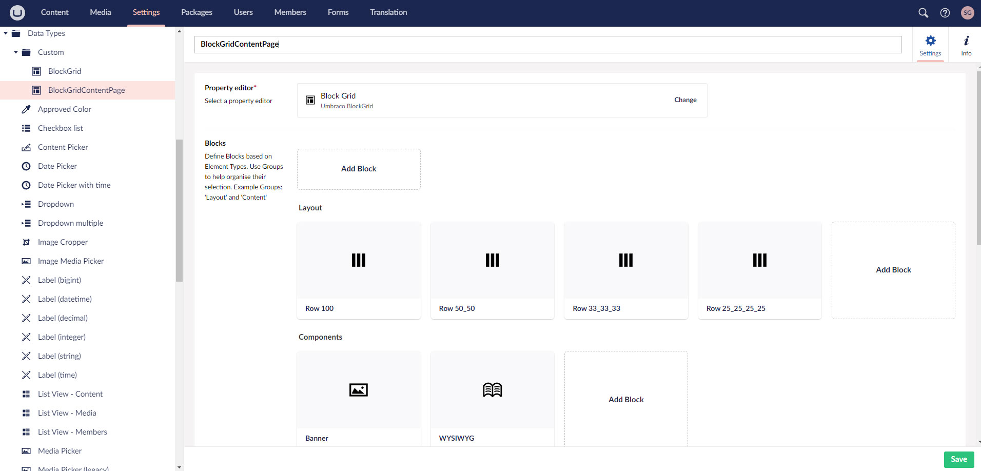
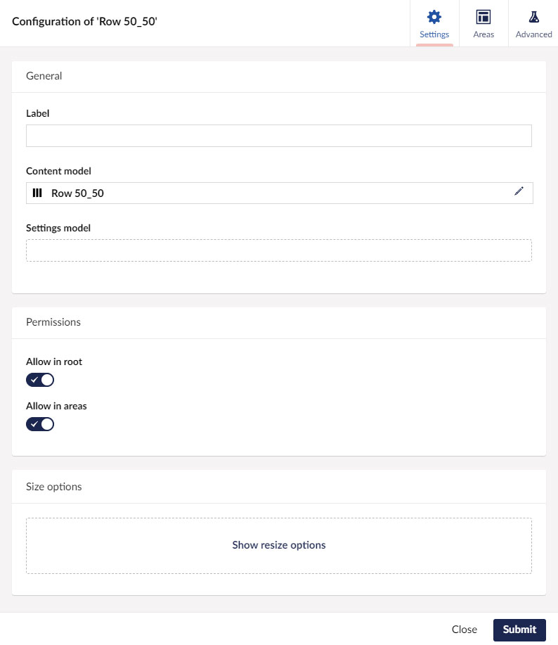
Now, work your way through each Row Component and configure as follows. Note that for our Layout components we only need to work on the Settings and Areas tabs - nothing is required on the Advanced tab:
On the Settings tab, check the Allow in Root and Allow in Areas options:
Moving to the Areas tab, Add the number of Areas required to represent the Grid within a Row.
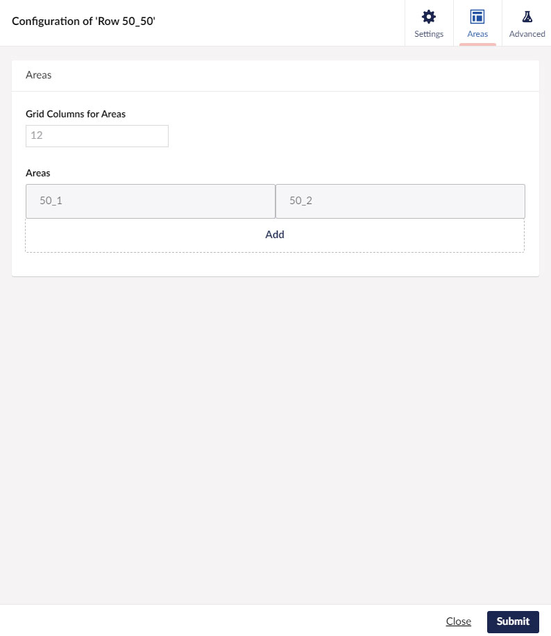
Here we have added 2 Areas, each consuming 6 out of the 12 columns available in the Row
When adding each Area to the Row component you are prompted to give it an Alias.
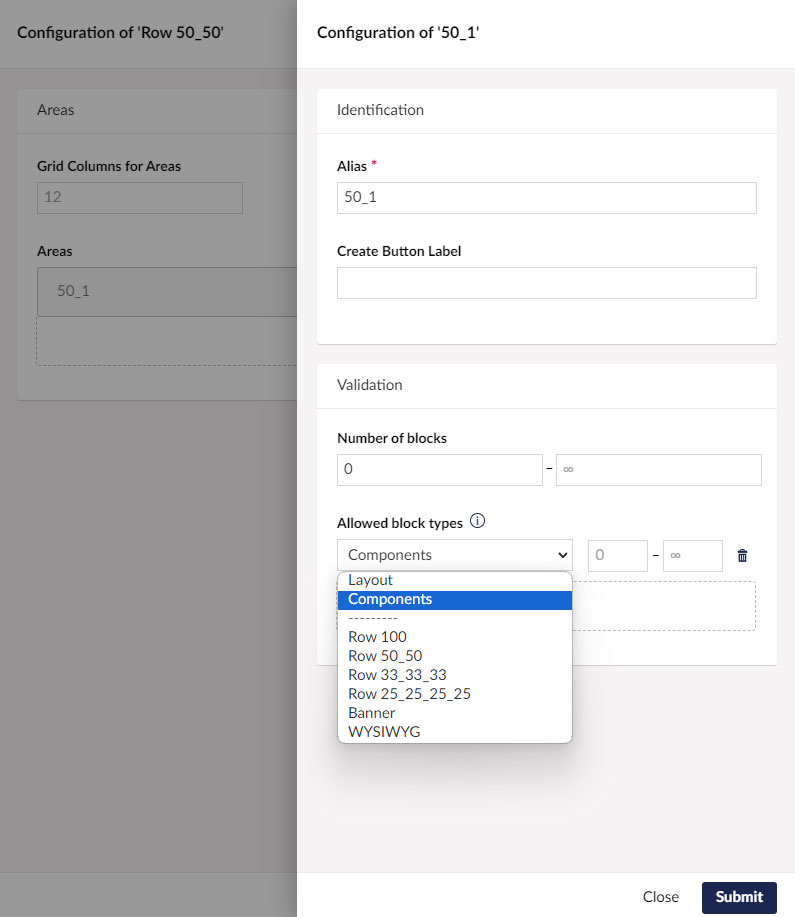
We keep it simple and just call ours 50_1 and 50_2, or perhaps 25_1, 25_2, 25_3 and 25_4 (for a 4 column row).
Finally you indicate what content is allowed within each Area. In the Allowed Block Types drop down, select Components. This will allow content creators to add any components in the Component folder created earlier on your Block Grid.
Step 3 - Add Bootstrap Grid CSS to Umbraco Block Grid
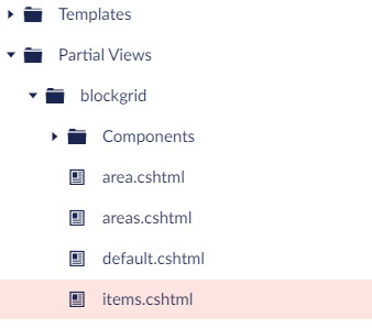
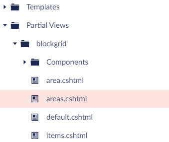
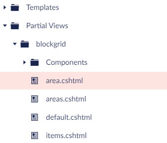
In step 3 we customise the standard Umbraco Block Grid partial views to render HTML that supports the Bootstrap CSS grid. This step involves working in the Settings > Partial Views > Block Grid folder, replacing each of the following Partial View files with the code provided:
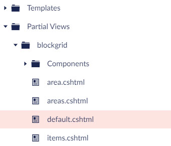
@using Umbraco.Extensions
@inherits Umbraco.Cms.Web.Common.Views.UmbracoViewPage<Umbraco.Cms.Core.Models.Blocks.BlockGridModel>
@{
    if (Model?.Any() != true) { return; }
}

@await Html.GetBlockGridItemsHtmlAsync(Model)
@using Umbraco.Cms.Core.Models.Blocks
@inherits Umbraco.Cms.Web.Common.Views.UmbracoViewPage<IEnumerable<BlockGridItem>>
@{
    if (Model?.Any() != true) { return; }
}

@foreach (var item in Model)
{
    bool isGrid = item.Areas?.Count() > 0;

    if (isGrid)
    {
        string screenWidth = item.Content.Value<string>("screenWidth", fallback: Fallback.ToDefaultValue, defaultValue: "central");
        string containerClass = screenWidth == "Central" ? "container" : "container-fluid";
        string backgroundColor = item.Content.Value<string>("backgroundColor", fallback: Fallback.ToDefaultValue, defaultValue: "FFFFFF");
        @:<div class="@containerClass" style="background-color:#@backgroundColor">
    }

    var partialViewName = "blockgrid/Components/" + item.Content.ContentType.Alias;
    try
    {
        @await Html.PartialAsync(partialViewName, item)
    }
    catch (InvalidOperationException)
    {
        <p>
        <strong>Could not render component of type: @(item.Content.ContentType.Alias)</strong>
        <br />
        This likely happened because the partial view <em>@partialViewName</em> could not be found.
        </p>
    }

    if (isGrid)
    {
        @:</div>
    }
}
@using Umbraco.Extensions
@inherits Umbraco.Cms.Web.Common.Views.UmbracoViewPage<Umbraco.Cms.Core.Models.Blocks.BlockGridItem>

@{
    if (Model?.Areas.Any() != true) { return; }
}

@foreach (var area in Model.Areas)
{
    @await Html.GetBlockGridItemAreaHtmlAsync(area)
}
@using Umbraco.Extensions
@inherits Umbraco.Cms.Web.Common.Views.UmbracoViewPage<Umbraco.Cms.Core.Models.Blocks.BlockGridArea>

@{
    string colClass = $"col-md-{Model.ColumnSpan}";
}

<div class="@colClass">
    @await Html.GetBlockGridItemsHtmlAsync(Model)
</div>
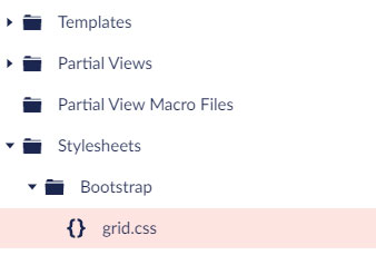
The final element of this step is to reference the Bootstrap Grid CSS file within the site Master / Default page. For simplicity we have extracted a version of the Bootstrap Grid CSS and added it into the Settings > Stylesheets > Bootstrap folder. Here is a link to download the bootstrap grid css only. Dont forget to add a link to this new stylesheet to your Master page:
<link rel="stylesheet" href="/css/bootstrap/grid.css"/>
Step 4 - Create Partial Views for Custom Umbraco Block Grid Components
In Step 4 we create the Partial Views HTML for each of the Element Types we created for our custom block grid components in Step1.
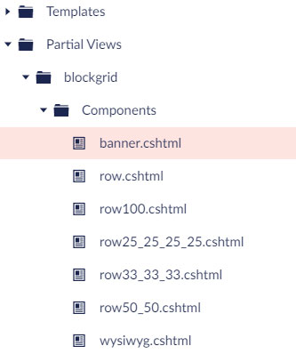
Starting with the Row components, here is the HTML for each Partial View.
Row.cshtml is referenced by each of the other Row components:
@using Umbraco.Extensions
@model Umbraco.Cms.Core.Models.Blocks.BlockGridItem

<div class="row">
@await Html.GetBlockGridItemAreasHtmlAsync(Model)
</div>
Row100, Row25_25_25_25, Row33_33_33 and Row50_50.cshtml all have the same HTML:
@using Umbraco.Extensions
@inherits Umbraco.Cms.Web.Common.Views.UmbracoViewPage<Umbraco.Cms.Core.Models.Blocks.BlockGridItem>
@Html.Partial("row", Model)
And for completeness, here is the HTML for our custom Banner and WYSIWYG component Partial Views for use within our Umbraco Block Grid:
Banner.cshtml
@using Umbraco.Extensions
@inherits Umbraco.Cms.Web.Common.Views.UmbracoViewPage<Umbraco.Cms.Core.Models.Blocks.BlockGridItem>

@{
    IPublishedContent image = Model.Content.Value<IPublishedContent>("Image");
    string imageUrl = image != null ? Umbraco.Media(image.Id).Url() : string.Empty;
    string content = Model.Content.Value<string>("content", fallback: Fallback.ToDefaultValue, defaultValue: null);
}
<div class="banner">
    @if (!string.IsNullOrWhiteSpace(content))
    {
        string contentPosition = Model.Content.Value<string>("contentPosition", fallback: Fallback.ToDefaultValue, defaultValue: null);
        string contentPositionModifier = string.IsNullOrWhiteSpace(contentPosition) ? "center_center" : contentPosition.Replace(" ", "-").ToLower();
        <div class="banner__content banner__content--@contentPositionModifier">
            @Html.Raw(content)
        </div>
    }
    @if (image != null)
    {
        <img src="@imageUrl" class="banner__image" />
    }
</div>
WYSIWYG.cshtml
@using Umbraco.Extensions
@inherits Umbraco.Cms.Web.Common.Views.UmbracoViewPage<Umbraco.Cms.Core.Models.Blocks.BlockGridItem>

<div class="rich-text">
    @Model.Content.Value("content")
</div>
Step 6 - How to Render Block Grid Components in the Umbraco Back Office
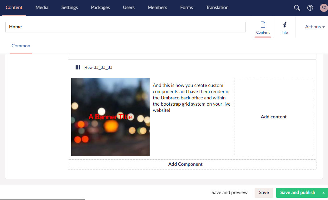
The final cherry on the top of our Bootstrap CSS Block Grid component cake is the ability to render our custom components in the Umbraco Back Office. Out of the box Umbraco does not render your components in their finished form in the back-office, meaning content managers have to constantly switch between the back office and the page preview function - bad vibes!
Lucky for us there is an Umbraco package called Umbraco.Community.BlockPreview that enables custom component rendering in the back office. Install this component to your Umbraco solution via NUGET.
It is possible to point your Custom Components in the Block Grid to a Partial View / CSS style sheet specifically for rendering in the Umbraco Back Office. The problem with this approach is that you end up with 2 Partial Views and 2 CSS files for each component - one to render it in the back office and the other to render it on the live website - not good for DRY principles!
The Block Preview package adds a plugin to Umbraco that links your Custom Components within your Block Grid to a generic Block Preview code block that acts as a proxy to your website Component Partial View meaning you can create just one Partial View / CSS file per component and have it used to render in the Back Office and the live website.

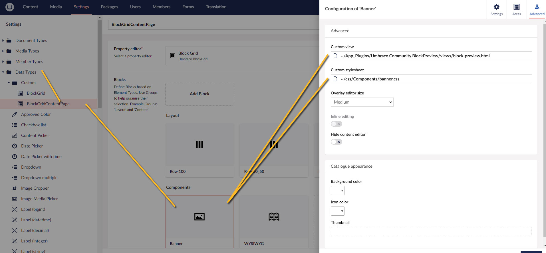
To use Block Preview, simply revisit your new Block Grid data type (created in step 3) and after selecting one of your custom components (e.g. Banner or WYSIWYG), click on the Advanced tab and point each at the Plugin block-preview.html file that is added when you install the Block Preview package:
You're done! You have completed all the steps required to easily create custom components for Umbraco Block Grid and have them render using the Bootstrap CSS grid system.
The last thing to do is to add your new Block Grid component to one of your Page Types and start using it.
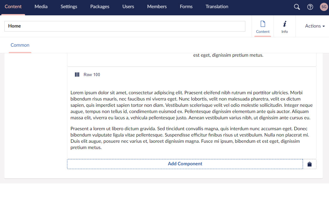
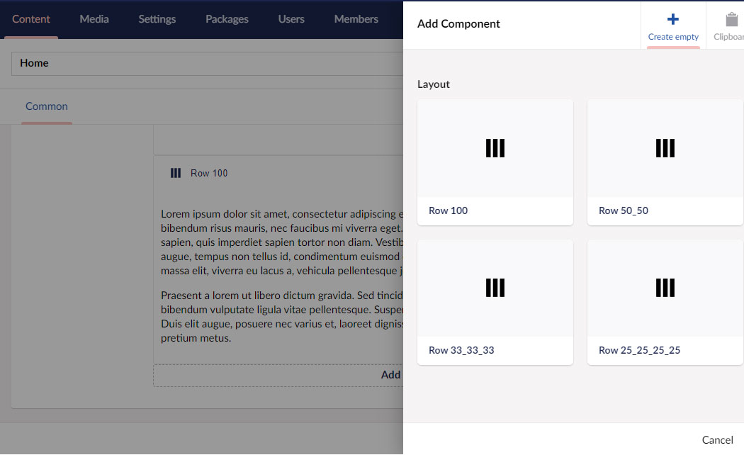
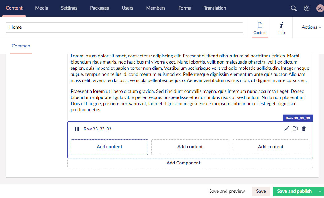
Here you can see how easy and simple it makes adding new rows with viewable components in the Umbraco back-office:
Add Component to Grid
Select Row Component
Set Row Properties
Add Content to Grid Row
Select Custom Component
Set Custom Component Properties
View Component Rendered in Umbraco Back Office
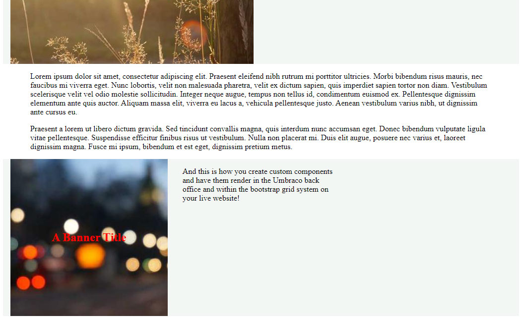
View Bootstrap Grid Layout on Website
Leave Your Comments...